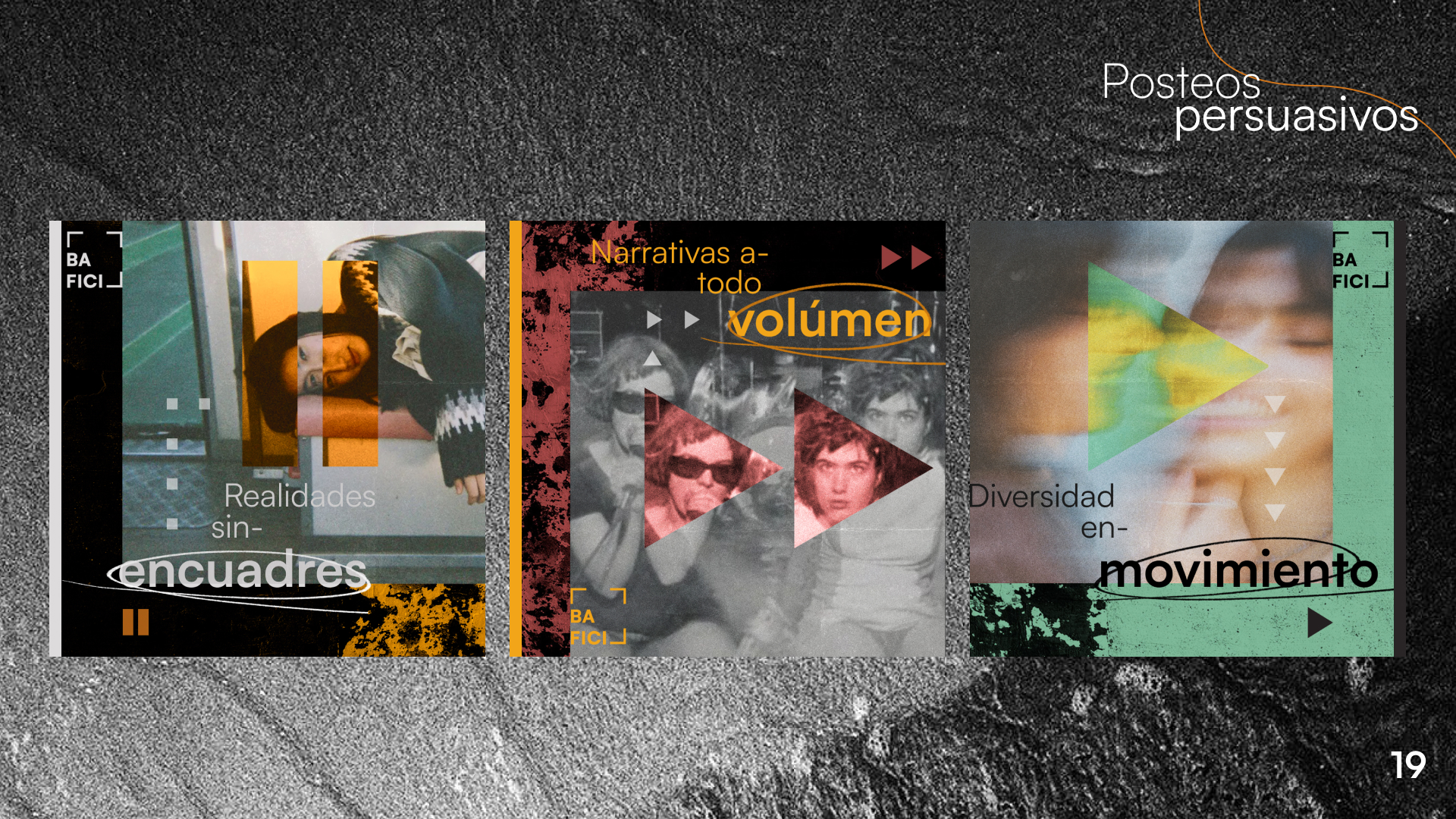
Project Overview
As part of a group of three people, we had to spend four months coming up with a new visual identity for an Argentinian Festival that, according to the professor, lacked a consistent representation of the theme that were celebrated. This development consisted of researching Festivals all around the world, previous editions of the festival to be redesigned, a moodboard, and several correction stages regarding the brand manual, and the subsequent pieces that supported the advertising of the event (new identity presentation poster, street posters, persuasive posters, social network posts and a mapping animation).
My Contributions
I was the main researcher and visual designer of all of the pieces that followed the brand manual and logo. After selecting three main concepts that we thought would represent BAFICI (indie, experimental and urban), I searched for similar events that could contain the basic elements of such concepts such as 90's skateboarding magazines, asian modern magazines and Leica's website, and combined them through a huge series of mockups until the first presentation poster was finished. From that point moving forward, it was a back and forth of several aesthetic and organization decisions, taking into account disorganization and human touched design was a main item of the aesthetic. My main goal was to reflect the crudeness of the indie industry and mixing it up with a clean disorganization that has logic behind it, therefor could be easily reflected in other designs.